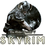
How can I make this look more like the Vanilla Morrowind Icons?
2 posts
• Page 1 of 1
Give me some suggestions to make this Icon look better.
How can I make this look more like the Vanilla Morrowind Icons?
-

Eric Hayes - Posts: 3392
- Joined: Mon Oct 29, 2007 1:57 am
If you're using Photoshop, try the various Artistic Filters on it and see if any of them come up with something you like. Good luck!
-

Darrell Fawcett - Posts: 3336
- Joined: Tue May 22, 2007 12:16 am
2 posts
• Page 1 of 1
