-

Trista Jim - Posts: 3308
- Joined: Sat Aug 25, 2007 10:39 pm
Wow! That's a really good painting, did you use oil paints?
why would you use paint when there is photoshop around
-

benjamin corsini - Posts: 3411
- Joined: Tue Jul 31, 2007 11:32 pm
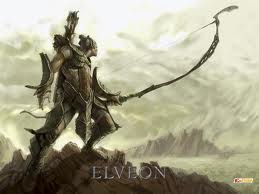
Great job pulling off that Skyrim nordic feeling 
The armor fits well and is unique. The pointing arm could've been painted smoother but looks great with the lightning and color nonetheless
Awesome job all in all ^^ +1
P.S: It's shown that you've invested your heart and enthusiasm into it.
The armor fits well and is unique. The pointing arm could've been painted smoother but looks great with the lightning and color nonetheless
Awesome job all in all ^^ +1
P.S: It's shown that you've invested your heart and enthusiasm into it.
-

Paula Rose - Posts: 3305
- Joined: Fri Feb 16, 2007 8:12 am
Wow, really good.  The only thing is that the cape seems a little fluffy and soft compared to the rest. But that could just as well been on purpose, as not to draw the focus away from the character itself. But a really good job nonetheless. :thumbsup:
-
Dean - Posts: 3438
- Joined: Fri Jul 27, 2007 4:58 pm
http://i200.photobucket.com/albums/aa172/frodo67/skyrim_wallpaper.jpg He's even pointing to VLC as a reminder to watch the trailer three times a day.
Haha, nice. He's pointing right at the VLC Media Player. Tis a sign.
-
Adam Baumgartner - Posts: 3344
- Joined: Wed May 30, 2007 12:12 pm
Wow! That's a really good painting, did you use oil paints?
Nope, this was done 100% digital. And thank you
why would you use paint when there is photoshop around
There's some reasons, actually. Digital paintings can look kinda "fake", because of filters, distortion and stuff, while traditional paintings have this certain "feel" to them. A computer can not truly recreate the effects of real paint, I think. I svck at traditional painting, though. :laugh: I miss the "undo" function in real life.
-
Ronald - Posts: 3319
- Joined: Sun Aug 05, 2007 12:16 am
why would you use paint when there is photoshop around
Because there's a huge difference in how you use it? And also a huge difference in how it will look? That's just a really stupid question you posted..
-

Vahpie - Posts: 3447
- Joined: Sat Aug 26, 2006 5:07 pm
Very, very good ! Well done !!! :tops:
-

Ludivine Poussineau - Posts: 3353
- Joined: Fri Mar 30, 2007 2:49 pm
Wow. Nice work! :thumbsup:
You've got some talent!
I'm not that great of an art critic, but here are my few criticisms:
- Composition is spot on. I love it.
- The legs might be a bit too short. Or perhaps the leg armor gives the illusion of the thighs being too short.
- Colors look great.
- The outstretched arm looks good, though you might want to revisit the inner elbow joint, and perhaps the upper arm might be too big, and the forearm too short. Hmm...dunno.
- The sword looks great, though I'd love to see some more details on the pommel.
- Lighting is wonderful.
Again, I'm not much of a critic. And I mean all of the above in the most positive and constructive way possible. :foodndrink:
This piece looks absolutely amazing! Great job! :trophy:
-

Joe Alvarado - Posts: 3467
- Joined: Sat Nov 24, 2007 11:13 pm
Amazing !!! You captured the look and feel of Skyrim perfectly.
-

brandon frier - Posts: 3422
- Joined: Wed Oct 17, 2007 8:47 pm
So much encouraging feedback! Thank you all!! :icecream:
Thank you! This is the most important thing to me. I know that I'm not where I want to be as an "artist". But I'm 100% self taught and no where professional (I started just 2 years ago with photoshop). And I have to compensate my lacking talent with working on stuff like this for hours and hours, while professionals would need maybe half the time I do
Thanks! Yeah, it was kinda on purpose, I also tried to make the sword as unspectacular as possible, because it's not a mayor focal point and would distract the eye a bit.
P.S: It's shown that you've invested your heart and enthusiasm into it.
Thank you! This is the most important thing to me. I know that I'm not where I want to be as an "artist". But I'm 100% self taught and no where professional (I started just 2 years ago with photoshop). And I have to compensate my lacking talent with working on stuff like this for hours and hours, while professionals would need maybe half the time I do
Wow, really good.  The only thing is that the cape seems a little fluffy and soft compared to the rest. But that could just as well been on purpose, as not to draw the focus away from the character itself. But a really good job nonetheless. :thumbsup:
Thanks! Yeah, it was kinda on purpose, I also tried to make the sword as unspectacular as possible, because it's not a mayor focal point and would distract the eye a bit.
-
Teghan Harris - Posts: 3370
- Joined: Mon Mar 05, 2007 1:31 pm
If it wasn't suggested already, kaio, you should contact Bethesda about your art for the Bethesda Blog (http://bethblog.com/index.php/2011/04/15/fan-art-update-2/).
-
Hussnein Amin - Posts: 3557
- Joined: Sun Aug 05, 2007 2:15 am
Can we call this his job application to Bethesda? I think they should hire him.
-
Miss K - Posts: 3458
- Joined: Sat Jan 20, 2007 2:33 pm
A tower. Or a chimney. :hubbahubba:
Towers or chimneys confirmed!
Very nice btw!
-
lillian luna - Posts: 3432
- Joined: Thu Aug 31, 2006 9:43 pm
That is indeed awesome. Share any further skyrim works please!
-
Jade Muggeridge - Posts: 3439
- Joined: Mon Nov 20, 2006 6:51 pm
Because there's a huge difference in how you use it? And also a huge difference in how it will look? That's just a really stupid question you posted..
no its not a stupid question, first because i have used both, the only difference is that photoshop looks cleaner, its faster, and its easy, in painting you get toxins into your lungs, you cant use the redo button, its takes for ever, but some people like the style, and other use it as a destressor, oh and painting is super expensive.
-

sw1ss - Posts: 3461
- Joined: Wed Nov 28, 2007 8:02 pm
Can we call this his job application to Bethesda? I think they should hire him.
Haha, that would be epic. Working for Bethesda on, lets say, Elder Scrolls VI would be a dream come true.
Towers or chimneys confirmed!Very nice btw!
:) Thanks
That is indeed awesome. Share any further skyrim works please!
Thank you! Of course I will. I might do a Khajiit next, because the new screenshot really empowered my imagination about them.
Very nice. Love it. 
Thank you!
-
Amy Gibson - Posts: 3540
- Joined: Wed Oct 04, 2006 2:11 pm
My New computer wallpaper. AMAZINGLY DONE.
-

.X chantelle .x Smith - Posts: 3399
- Joined: Thu Jun 15, 2006 6:25 pm
One is impressed with another's effort
Hopefully, I'll be able to get some fan art done before the game arrives.
Hopefully, I'll be able to get some fan art done before the game arrives.
-

Alex Vincent - Posts: 3514
- Joined: Thu Jun 28, 2007 9:31 pm
